Configurators
The configurator components were created to ease the customization process and, in some cases, extend the functionality of certain controls. To use them, add them to the prefab root after instancing a prefab.
There are some examples for all configurators in the test scenes in the MRTK Demo project.
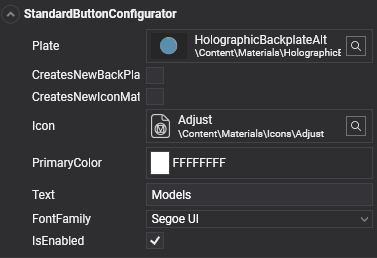
Standard button configurator
This configurator can manage the configuration of certain aspects of a basic button, like the icon, the button text and the material plate. If the color should also be changed, the CreatesNewIconMaterialInstance and CreatesNewBackPlateMaterialInstance checkboxes will do so that the change does not affect other instances.
ToggleButton
When added to a button, the ToggleButton component extends its base functionality, so the button will have two different styles depending on whether it is in the ON or the OFF state. This component adds two ToggleButtonConfigurator components, which can be used to configure each state in a very similar way as the StandardButtonConfigurator.
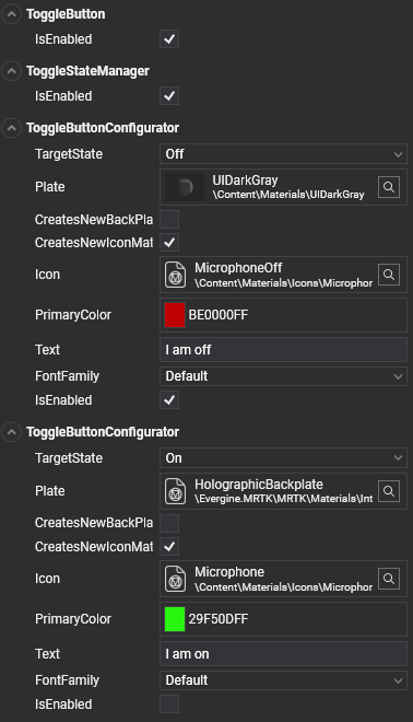
MultiState buttons
The ToggleButton component adds the ToggleStateManager and two ToggleButtonConfigurators to the button. There's also an implementation for tristate buttons by way of adding a MultiStateStateManager and three MultiStateButtonConfigurator components to a button.
All these *StateManager classes extend the BaseStateManager class using an enum with all the states a button can have. If more than three states are needed, a new class can be created using this base class and a custom enum. The configurator components also need to be implemented using this enum, so each one is associated to a single state.
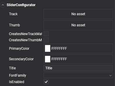
Slider configurator
This configurator contains specific settings to change the track and thumb materials and the label text in a slider.