Features
There are a list of different controls that you can create with just a few lines of codes, here is the complete list:
Window
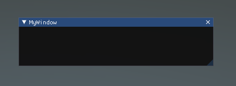
Windows are drag-able containers of Controls. They can receive and lose focus when clicked. Because of this, they are implemented slightly differently from the other Controls. Each Window has an id number, and its contents are declared inside a separate function that is called when the Window has focus.
ImguiNative.igSetNextWindowPos(new Vector2(420, 120), ImGuiCond.Appearing, new Vector2(1, 0.5f));
ImguiNative.igSetNextWindowSize(new Vector2(400, 100), ImGuiCond.Appearing);
ImguiNative.igBegin("MyWindow", this.imguiDemoOpen.Pointer(), ImGuiWindowFlags.None);

// Controls

ImguiNative.igEnd();

LabelText
The LabelText is non-interactive. It is for display only. It cannot be clicked or otherwise moved. It is best for displaying information only.
ImguiNative.igBegin("MyWindow", this.imguiDemoOpen.Pointer(), ImGuiWindowFlags.None);

ImguiNative.igLabelText("This is a label", "Value1");
ImguiNative.igLabelText("This is other label", "Value2");

ImguiNative.igEnd();

Button
The Button is a typical interactive button. It will respond a single time when clicked, no matter how long the mouse remains depressed. The response occurs as soon as the mouse button is released.
ImguiNative.igBegin("MyWindow", this.imguiDemoOpen.Pointer(), ImGuiWindowFlags.None);

if (ImguiNative.igButton("Press me", new Vector2(100, 25)))
{
    clicked++;
}

if (clicked > 0)
{
    ImguiNative.igText("Thanks for clicking me!");
}

ImguiNative.igEnd();

Text
The Text Control is an interactive, editable single-line field containing a text string.
ImguiNative.igBegin("MyWindow", this.imguiDemoOpen.Pointer(), ImGuiWindowFlags.None);

ImguiNative.igText("This is a text control");

ImguiNative.igEnd();

InputText
The InputText Control is an interactive, editable area containing a text string.
Toggle
The Toggle Control creates a checkbox with a persistent on/off state. The user can change the state by clicking on it.
Toolbar
The Toolbar Control is essentially a row of Buttons. Only one of the Buttons on the Toolbar can be active at a time, and it will remain active until a different Button is clicked. This behavior emulates the behavior of a typical Toolbar. You can define an arbitrary number of Buttons on the Toolbar.
SelectionGrid
The SelectionGrid Control is a multi-row Toolbar. You can determine the number of columns and rows in the grid. Only one Button can be active at time.
HorizontalSlider
The HorizontalSlider Control is a typical horizontal sliding knob that can be dragged to change a value between predetermined min and max values.
VerticalSlider
The VerticalSlider Control is a typical vertical sliding knob that can be dragged to change a value between predetermined min and max values.
HorizontalScrollbar
The HorizontalScrollbar Control is similar to a Slider Control, but visually similar to Scrolling elements for web browsers or word processors. This control is used to navigate the ScrollView Control.
VerticalScrollbar
The VerticalScrollbar Control is similar to a Slider Control, but visually similar to Scrolling elements for web browsers or word processors. This control is used to navigate the ScrollView Control.
ScrollView
ScrollViews are Controls that display a viewable area of a much larger set of Controls.
Images
The images control allow to display the content of texture, this is a non-interactive control.