Configurators
Configurator components simplify customization and, in some cases, extend functionality for specific controls. To use a configurator, add it to the root of a prefab after instantiating the prefab.
Examples for each configurator can be found in the test scenes within the MRTK Demo project.
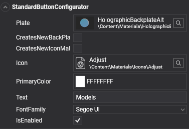
Standard Button Configurator
The Standard Button Configurator allows easy customization of certain button elements, such as the icon, button text, and material plate. If you want to change the color without affecting other button instances, check the CreatesNewIconMaterialInstance and CreatesNewBackPlateMaterialInstance options to ensure unique instances.
| Property | Description |
|---|---|
| Plate | Material used as the back plate of the button. |
| CreatesNewBackPlateMaterialInstance | Creates a new material instance for the back plate, allowing runtime modifications without affecting other elements sharing the same material in the UI. |
| CreatesNewIconMaterialInstance | Creates a new material instance for the icon, enabling independent runtime adjustments. |
| AllowBackPlateNullMaterial | Allows a null material to be used for the back plate. |
| AllowIconNullMaterial | Allows a null material to be used for the icon. |
| Icon | Material used for the button icon. |
| PrimaryColor | Sets the primary color used to tint the icon and define the text color. |
| Text | Text displayed on the button. |
| TextScale | Scale factor for the button text. |
| Font | Font used for the button text. |
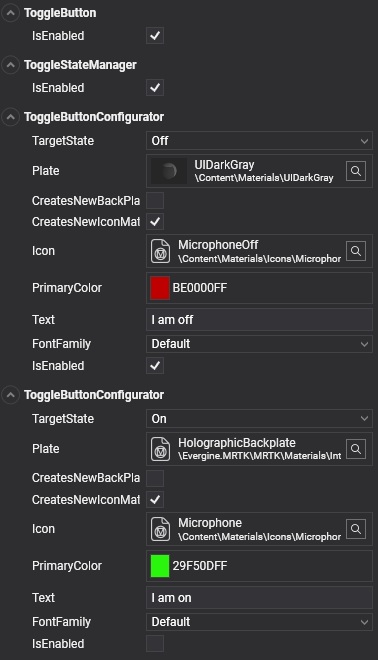
ToggleButton
Adding the ToggleButton component to a button provides two distinct styles based on its ON or OFF state. This component automatically adds two ToggleButtonConfigurator components, allowing for customized configuration of each state similar to the Standard Button Configurator.
Take a look to sample scene for buttons (Buttons.wescene) at https://github.com/EvergineTeam/MixedRealityToolkit/tree/master/Samples/Evergine.MRTK.Demo/Content/Scenes/Samples.
Multi-State Buttons
The ToggleButton component also includes the ToggleStateManager and two ToggleButtonConfigurators, enabling multi-state functionality. For tri-state buttons, you can use the MultiStateStateManager and three MultiStateButtonConfigurator components to manage three separate states.
All StateManager classes inherit from the BaseStateManager class, which uses an enum to define possible button states. For more than three states, create a custom class using BaseStateManager with a new enum defining the extra states. Each configurator component should then correspond to a unique state using this custom enum.
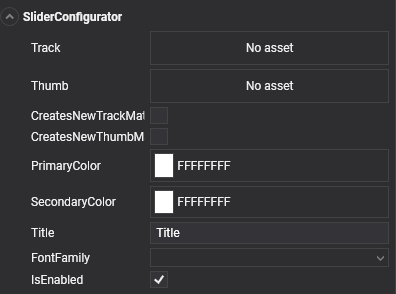
Slider Configurator
The Slider Configurator offers specific options to customize the slider’s track, thumb materials, and label text.
| Property | Description |
|---|---|
| Track | Material used for the track mesh. |
| Material | Material used for the thumb mesh. |
| CreatesNewTrackMaterialInstance | Creates a new material instance for the track, enabling unique runtime modifications. |
| CreatesNewThumbMaterialInstance | Creates a new material instance for the thumb, allowing independent runtime adjustments. |
| PrimaryColor | Sets the primary color, affecting the title color. |
| SecondaryColor | Sets the secondary color, affecting the value display color. |
| Title | Title displayed on the slider. |
| Font | Font used for the slider’s text. |
Take a look to sample scene for sliders (Sliders.wescene) at https://github.com/EvergineTeam/MixedRealityToolkit/tree/master/Samples/Evergine.MRTK.Demo/Content/Scenes/Samples.