CheckBox
The Checkbox user control provides a simple way for users to make binary choices (checked or unchecked) within an interface. It is typically used in forms or settings where users need to indicate agreement, preference, or selection of options. The checkbox state is visually represented by a filled or empty box, which can be toggled by clicking or tapping on it. This control is available as the CheckBox.weprefab prefab in MRTK
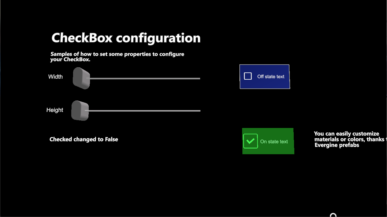
Configuration Properties
| Property | Description |
|---|---|
Size |
Sets checkbox dimensions. |
IsChecked |
Gets or sets a value indicating whether the checkbox is checked. |
Events
| Event | Description |
|---|---|
IsCheckedChanged |
Raised when the checkbox state changes. |