ComboBox
The ComboBox user control allows users to select an option from a dropdown list. It is distributed via a prefab named ComboBox.weprefab.
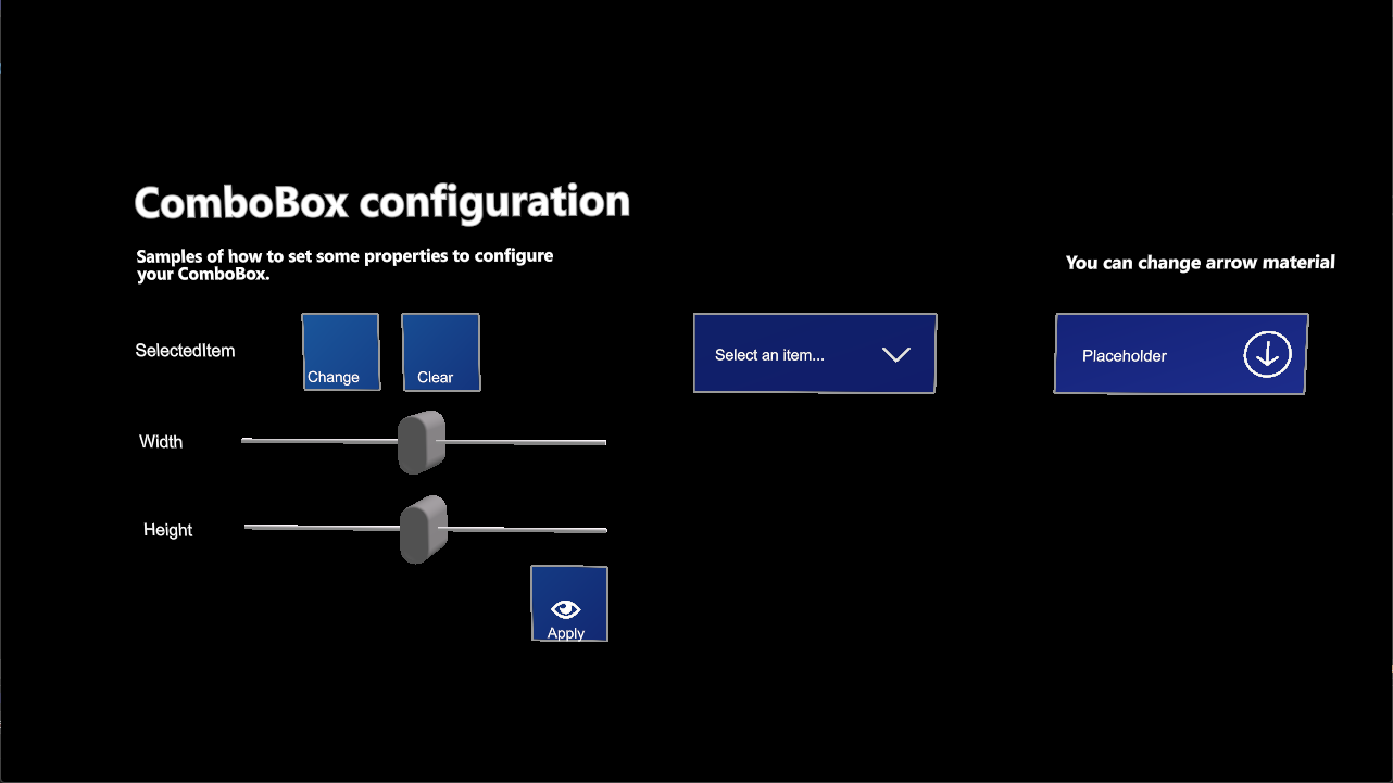
Configuration properties
| Property | Description |
|---|---|
| IsPopupOpen | Indicates if the item selection popup is open. |
| DataSource | This is the data adapter used to populate data. Learn more about data adapters. |
| SelectedItem | Gets or sets the selected item. |
| PlaceholderText | Gets or sets the placeholder text to be displayed when no element has been selected. |
| ArrowMaterial | Material for the drop-down arrow. |
| Size | Sets the ComboBox dimensions. |
| MaxItemsHeight | Gets or sets the maximum height for the items area. |
Events
| Event | Description |
|---|---|
| SelectedItemChanged | Raised when the selection is changed. |