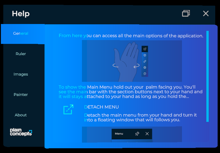
Tabs Control
The Tabs control provides basic infrastructure and functionality for adding tabbed panels to your application. It offers a container and a tab navigation system.

It includes the following properties for customizing the control:
| Properties | Description |
|---|---|
Size |
Sets the size for the container. |
SelectedItem |
Sets the selected tab and displays the associated content. |
Builder |
Returns a TabControlBuilder. |
Create a Tab Control programmatically
The easiest way to create a tab instance is to use the TabControlBuilder, which provides features related to adding content to the tab control.
| Methods | Description |
|---|---|
AddItem |
Adds a single item to the tab control. |
AddItems |
Adds a set of items to the tab control. |
WithSize |
Specifies a size for the tab control. |
WithActiveItemTextColor |
Specifies the text color for the active tab item. |
WithInactiveItemTextColor |
Specifies the text color for the inactive tab item. |
var tabEntity = TabControl.Builder
    .Create()
    .WithSize(new Vector2(0.3f, 0.2f))
    .AddItem(new TabItem
    {
        Name = () => "Tab Name",
        Contents = () => this.CreateContent(), // Function to set content entity
    })
    .Build();
In XRV, we use this tab control builder in configuration and help windows. If you want a window where the only content entity is a tab control, you can utilize the TabbedWindow class.
Tab items definition
TabItem provides the tabs and content for the tab control.
| Properties | Description |
|---|---|
Name |
The name of the tab |
Data |
General-purpose data associated with the tab. |
Order |
The order in which the tab should be displayed. |
Contents |
The content associated with the tab item. |